
When plotting experimental data with MATLAB, commands like ezplot, plot etc. couldn’t be used because the data points may not be in a proper graph due to errors of those data points. Therefore, there’s a need of plotting the best graph for the data points that we have in out hand. As a solution, cftool command could be used in MATLAB.
Ways to Enter Data to be plotted
Think you have to plot a graph with following data points.
| t (seconds) | 1 | 2 | 3 | 4 | 5 |
| h (centimeters) | 5.2 | 6.6 | 7.3 | 8.6 | 10.7 |
First thing is those data should be entered into MATLAB. So how to do that?
If you analyze two variables, you could see that the variable t is a continuously increased variable. So you could use one from following code methods to enter this variable.
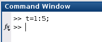
>>t = 1:5;
>>t = [1 2 3 4 5];
>>t = [1, 2, 3, 4, 5];
>>t = [1; 2; 3; 4; 5];
Since variable h is not a continuously increased variable. Therefore, we couldn’t use the first method that we have used above. So you could use one from the following coding methods to add this variable.
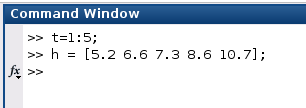
>>h = [5.2 6.6 7.3 8.6 10.7];
>>h = [5.2, 6.6, 7.3, 8.6, 10.7];
>>h = [5.2; 6.6; 7.3; 8.6; 10.7];
Plot with Curve Fitting Tool (cftool)
Now, what you have to do is plot the best suitable graph for the data points that you have entered. Therefore, you could use the Curve Fitting Tool of MATLAB using following command.
>>cftool
When you enter the above command, you will be getting a window as in above (Figure 03).
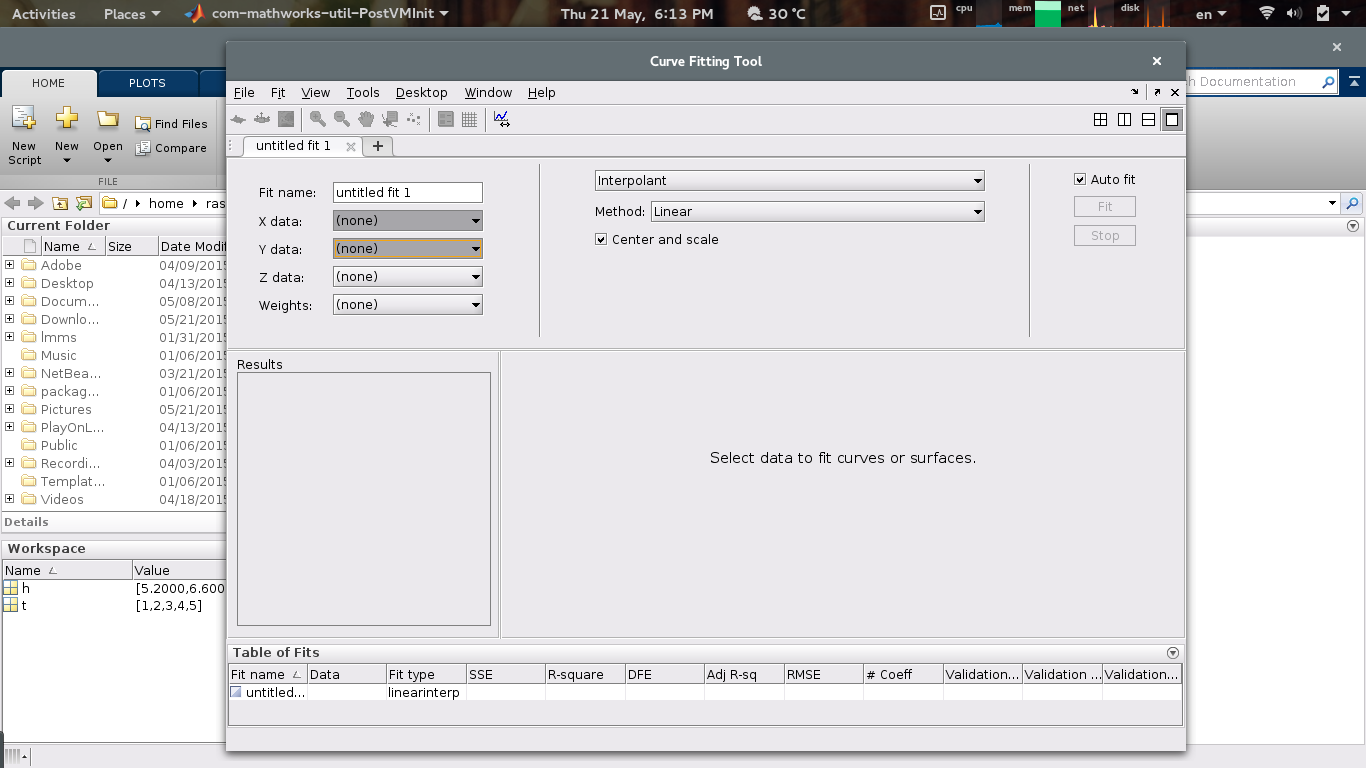
Now change Fit name into a reasonable name as you wish. Now, you have to select data variables. First select your X data (in here it’s t). Then you have to select your Y data (in here it’s h). Of course you could have a Z data and plot a 3D graph too. But here we’re going to describe basics so it’s enough to plot a 2D graph to describe.
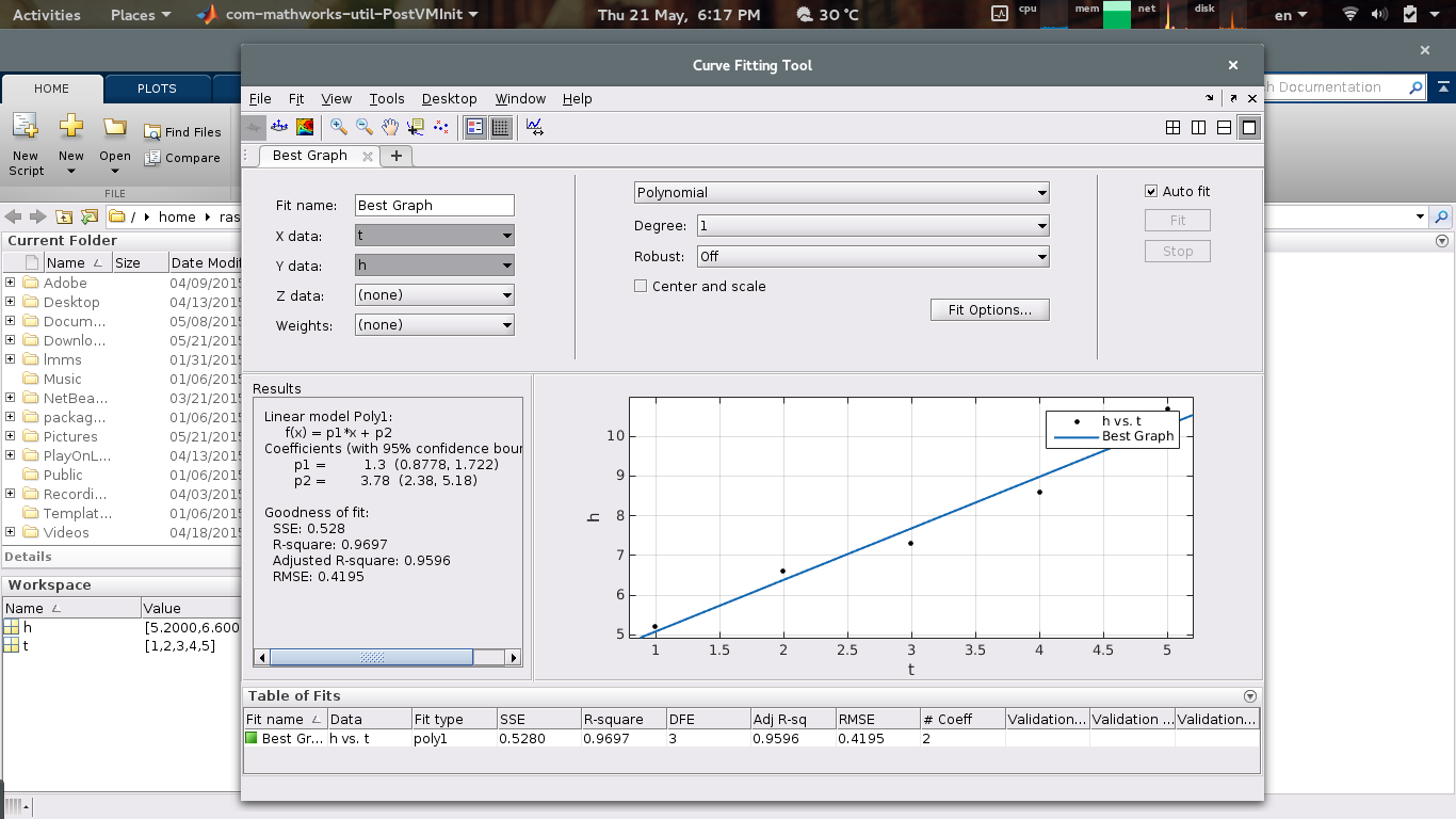
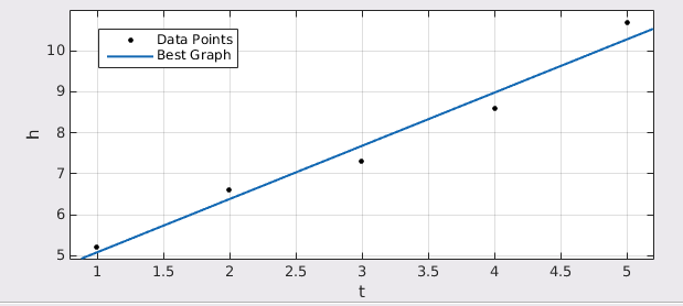
Once you have selected data points, you will be getting a graph as in above (Figure 04).
You could change the position of the description of the graph by dragging it to the new position. Also if you need to change captions of the description, you could change it by double clicking on the caption and renaming it.
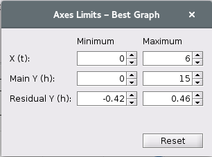
To have a proper graph, you may need to change the limits of axes. To do that, you need to go to Tools –> Axes Limits menu so you will be getting a dialog box as in above (Figure 06). In the dialog box, you could change the range of X and Y axes as you wish.
In here we have used Polynomial Fitting Option. Instead of that you could change the option as you wish and you could check for the best fitting option that your data points are matched into.
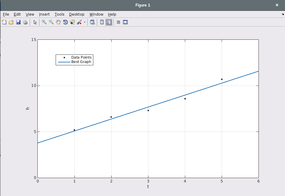
Now to end working with curve fitting tool, go to File –> Print to Figure menu so the graph will be printed to a figure.
If you have any questions or ideas to improve this article, please comment them here or email them to us.